
Product
Thermal Receipt Design Principles for Epson TM-T82
August 202611 min read
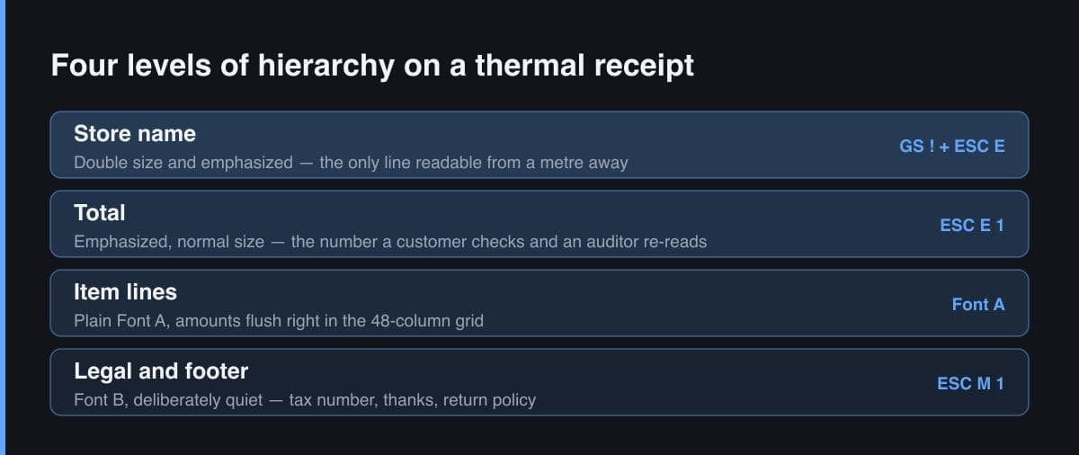
Emphasized print is the only control that directly increases how much of the paper's coating is darkened per character. That extra density is what survives cheap paper, a worn print head and the gradual fading of thermal paper, which is why the total and the shop name should be emphasized even when nothing else is.
Four in practice: a double-size emphasized store name, an emphasized total or section label, plain Font A body text, and smaller Font B for legal and footer lines. Adding a fifth level weakens the other four, because the reader loses the ordering between them and scans the whole ticket instead.
Usually not. A raster logo or a full-width reverse block is the slowest and most power-hungry thing a thermal printer can do, it wears the head unevenly, it curls the paper, and it fades into a grey smudge faster than text does. A crisp double-size text header identifies the shop just as well and costs almost nothing.
There is no ink: the dark areas are a heat-triggered reaction in the paper's coating, and that coating keeps reacting to heat, light, oils and friction after printing. Design cannot stop it, but it can decide what survives — keep shop identity, date, transaction number and total in the darkest, largest treatment, and offer a QR code or short URL for a durable digital copy.
One blank line between logical blocks and no more. At 203 dpi a blank Font A line is roughly three millimetres of paper, so a shop doing several hundred tickets a day pays for every extra gap. End with the smallest feed that still lets a hand grab the ticket, typically three or four lines before the cut.
Key Takeaway
Designing a thermal receipt means designing inside a 48-column monospaced grid where every dot is either burned or blank. Emphasis comes from four ESC/POS controls — bold, double-strike, character size and font selection — and using them sparingly is what makes a total readable on cheap paper.
A receipt is the only user interface most customers of a small shop will ever hold. It is also the most constrained interface I have ever designed for: no colour, no greys, no proportional type, one column 72 millimetres wide, and a printing surface that starts fading the moment it leaves the printer. Everything that makes web typography pleasant is unavailable.
What is left is a small set of physical controls and a lot of discipline. This is the set of principles I arrived at after redesigning the same receipt about fifteen times against a TM-T82, and after watching cashiers and customers actually use the paper.
Three properties of thermal line printing shape every decision that follows, and none of them are negotiable in software.
Once you accept these, the design question stops being what looks good on screen and becomes what stays readable after the paper has spent a week in a wallet.
ESC/POS gives you a handful of ways to make text stand out. They are not interchangeable — each trades something away, and knowing what makes the difference between a receipt that reads well and one that is just loud.
| Control | What it does | What it costs |
|---|---|---|
| ESC E 1 — emphasized | Prints each character darker and slightly heavier; the standard bold | Slightly slower and more energy per dot; loses all meaning if used on more than a few lines |
| ESC G 1 — double-strike | Prints the same line twice for extra density on tired heads or poor paper | Doubles the time for that line and can smear if the paper is already dark |
| GS ! n — character size | Doubles height, width or both, so a header reads across a counter | Double width halves your column budget from 48 to 24 on that line |
| ESC M 1 — Font B | Smaller 9 by 17 cell, 64 columns, ideal for legal and footer text | Noticeably harder to read on cheap paper and for older eyes |
| GS B 1 — reverse video | White text on a solid black block, maximum attention | Burns the entire cell area: slow, heavy on the head and battery, and the block fades unevenly |
My working rule is that a receipt may use at most three of these on any single ticket. Beyond that the reader loses the ordering between them, and the receipt reads as noise with some large text in it.
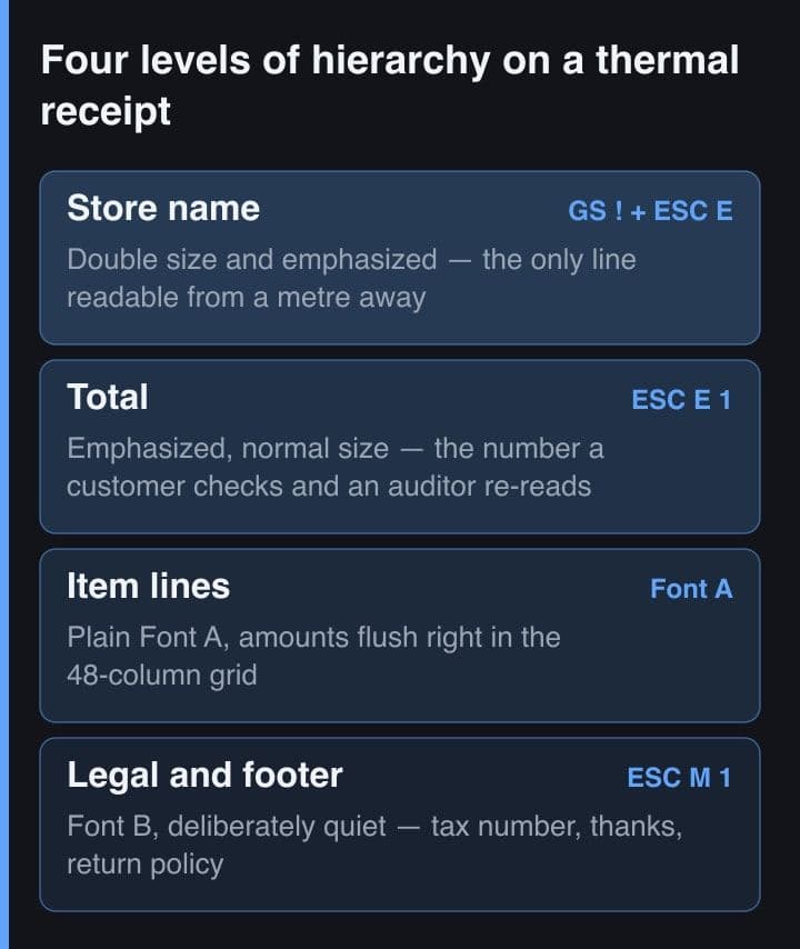
Print typography gives you dozens of levels. A receipt supports four, and trying for a fifth just weakens the other four. This is the ladder I use, expressed directly as the commands that produce it.
Level 1  store name        GS ! 0x11 + ESC E 1   double size, emphasized
Level 2  section label      ESC E 1               normal size, emphasized
Level 3  item lines         Font A, plain         the body text of a receipt
Level 4  legal / footer     ESC M 1 (Font B)      smaller, deliberately quiet

TOKO SUMBER REJEKI          <- level 1, the only double-size line
Jl. Diponegoro 12                level 4
2026-08-18 14:32  Kasir: Rina    level 4
------------------------------------------------
Kopi Susu Gula Aren               2 x 25.000
                                      50.000    <- level 3
Roti Bakar Coklat                 1 x 18.000
                                      18.000
------------------------------------------------
TOTAL                                 68.000    <- level 2, emphasized
TUNAI                                100.000
KEMBALI                               32.000
------------------------------------------------
      Terima kasih atas kunjungan Anda           level 4
The important discipline is that level 2 exists exactly once or twice per receipt. If the subtotal, the tax line, the total and the change are all emphasized, then none of them is, and the customer scans the whole block looking for the number they care about.
Print your candidate layout, then look at it from a metre away for one second — the distance and time a customer actually gives a receipt. Whatever you can read in that second is your real hierarchy, regardless of what you intended.
On a screen you can adjust colour, weight and size independently. On thermal paper, emphasized print is the only control that directly increases the amount of darkened coating per character, which means it is the only control that buys you resistance to fading, weak paper and a worn head.
There is a second reason to be sparing that only shows up on battery-powered printers: darkening more dots draws more current. A layout full of emphasized text and black blocks measurably shortens a mobile printer's shift.
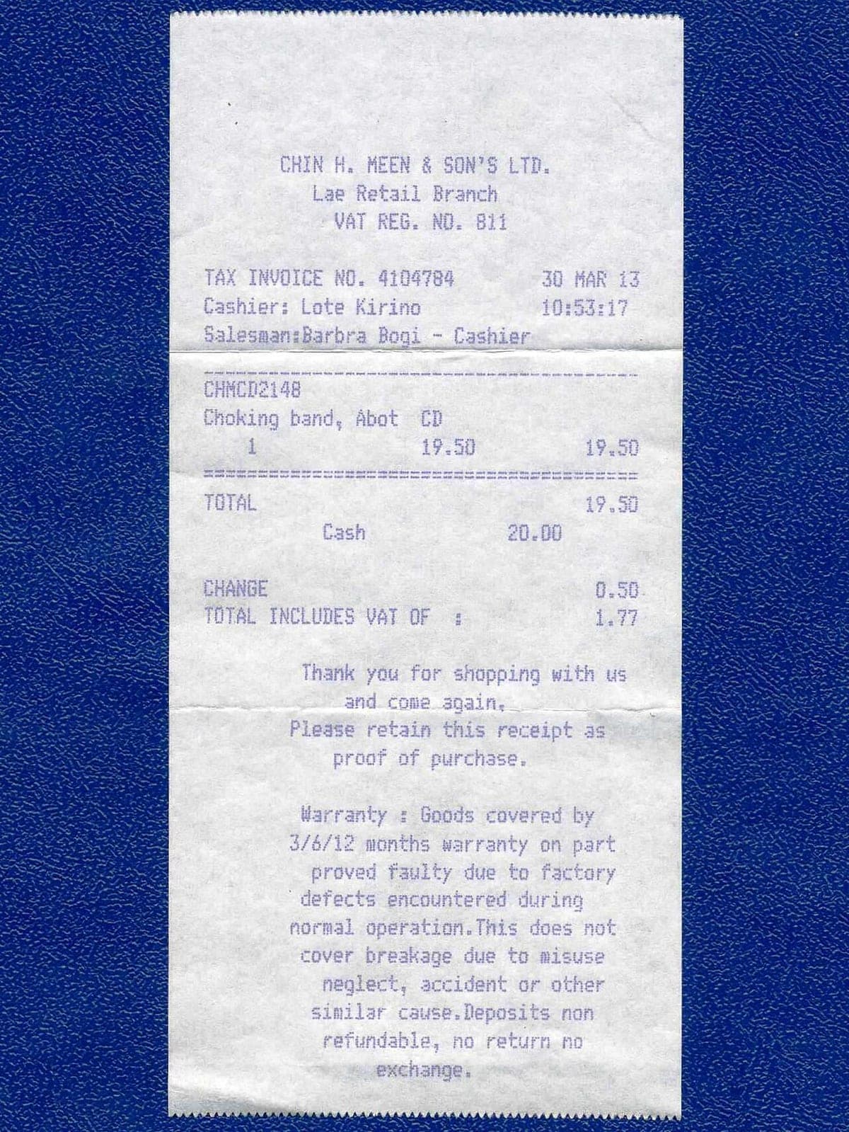
Thermal paper has no ink. The dark areas are a chemical reaction in a coating, and that coating stays reactive: sunlight, a hot dashboard, the oils on a receipt in a back pocket and simple abrasion all keep pushing it. A receipt that is crisp today can be unreadable in a summer month, and archival storage guidance for thermal rolls is genuinely about temperature and humidity ranges rather than about the printer.
The design implication is concrete. Assume partial loss and make sure the surviving 20 per cent is the part that matters: shop identity, date, transaction number and total. Fine print can fade without consequence; a faded total is a dispute. If customers need a durable copy — a warranty, a business expense — print a short URL or a QR code that resolves to the digital receipt instead of pretending the paper will last.
Resist the large black logo. A full-width reverse block or a heavy raster image is the slowest, hottest, most power-hungry thing a thermal printer can do; it wears the head unevenly, it curls the paper, and it fades into a grey smudge faster than text does. A crisp text header outlives a beautiful logo every time.
Vertical space on a receipt costs money and time in a way it never does on screen: at 203 dpi a blank Font A line is roughly three millimetres of paper, and a shop doing eight hundred tickets a day pays for every one of them.
Before shipping a layout, I run it through five checks. They take ten minutes and have caught something almost every time.
Receipt design is constraint design. There is no colour to hide behind and no font to swap in, so the whole craft is deciding which two or three lines deserve the printer's darkest output and letting everything else stay quiet. Get that ordering right and a 48-column monospaced ticket reads better than most dashboards.